


Kain Capital
Palliative and Hospice Care Centers
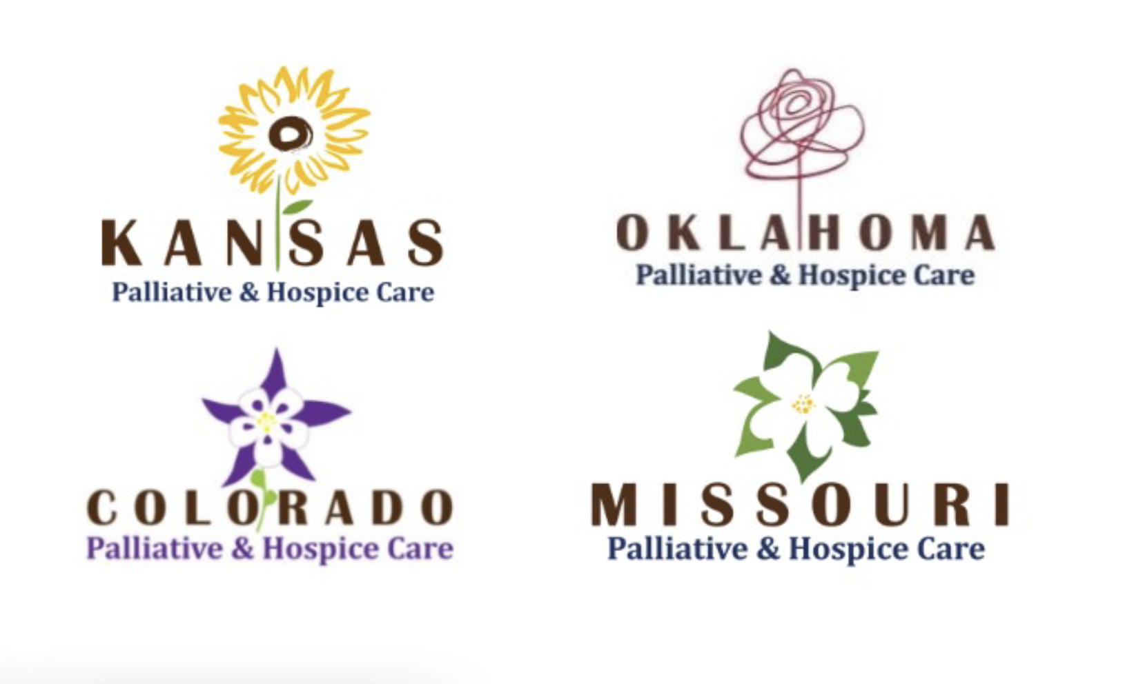
the old logos
the brief
A group of hospice care centers needed a logo upgrade. Their existing logos, based on state flowers, didn’t visually have much in common aside from typography. They were considering changing just the typefaces, but were also interested to see a whole new look.
I offered a scalable, flexible treatment of the state flower so they could share a common visual thread, and suggested possible combinations of new and old logos and typefaces.

They ultimately chose a new look and a new typeface.
The new logo uses a visual language that will be easily applied to new states/flowers as they expand; each uses one main color, and much more intentionally than in the previous logos.
The typeface (Circe Slab) is light and approachable, rendering a somewhat heavy or intimidating topic a little more inviting.


Kain Analytics
the brief
Kain Capital was launching a subsidiary group, Kain Analytics, which would use data and analytics to better serve the medical community. The logo had to evoke the parent company, but be able to stand on its own as a distinct brand.
I showed four possible logos inspired by data imagery, such as charts and data points.


They ultimately opted for the first design, with the original logo rendered with rising data points. The new logo seamlessly integrates the main element in the parent logo, using the same colors but in different proportions. It can be easily animated and translates well across different formats. It also provides a convenient visual shorthand in rising data points motif, suggesting movement and growth.
See the logo in action at kaincap.com/kain-analytics.